Bridging the Gap With Wet Lab Using R Shiny
Posted on Sat 04 May 2024 in how-to
How do you communicate results of an analysis? What tools do you use? Scientists that work in the wet lab are accustomed to firing up excel or some instrument-specific software and working with their own data. For genomics or other types of experiments in biology that result in large datasets this approach is problematic and bioinformaticians have other tools to deal with our data. Often, this involves working with large data in a programmatic way, and the two languages in common usage are Python (usually including its data science stack pandas et al.) and R (usually including the tidyverse, bioconductor, and friends).
There is obvious friction here. Bioinformatics scientists have a toolkit that works great for us, but is foreign to a lot of the wet lab scientists around us. How can we bridge this gap?
A Common Example
Your wet lab colleagues want to determine which genes are affected by treatment with a compound, or test the effect of a mutation in a cell line/plant/mouse on gene expression, etc. These situations are common applications for RNAseq. Typically, they also involve a simple experimental design; a comparison of two sample groups (treatment or mutant vs control).
The bioinformatician performs their analysis using a workflow resulting in fold changes, adjusted p-values, etc. in a table. They create a visualization to help summarize the results to their colleagues, perhaps a volcano plot. Then ensues a back and forth collaboration, resulting in requests to modify visualizations, look at specific lists of genes, and more. While this process is rewarding, and can result in a fruitful experiment, it can also be very inefficient. It can also result in frustration on the part of both the bioinformatician and wet-lab scientist. The bioinformatician because they want to be the most helpful, but the wet lab scientist isn't experienced in exploring their data with the same tools. The wet lab scientist wishes they could be more independent. This back and forth can take a lot of time.
There are ways around this, graphical platforms that enable low/no-code ways to analyze NGS or other big data. These are typically commercial products with a lot of functionality, and despite being low/no-code there is still a learning curve. Often the wet lab scientists want something simple, a way to explore an already analyzed dataset supplied to them by their collaborating bioinformatics scientist.
The Shiny Framework
Shiny is a framework for creating web applications quickly, with minimal code required for an interactive app. Originally only for R, it now supports Python as well. We'll be using it with R in this example. There are other options (such as Dash) so if you'd rather use those, knock yourself out. I find Shiny's R syntax to be relatively easy to work with, and very quick to learn.
What if we could create, in a matter of a few hours (depending on your experience level), an application that runs in a web browser that enables our wet lab friends to explore their analyzed datasets? It's not that hard. I promise. If you have written a few functions and made some plots in R, Python, or some other programming language then you know most of what you need to get started.
Our Goal
For this example, we will create a Shiny application which generates volcano plots from DESeq2 results. This example app will have the following features:
- Load results tables via browsing the local system.
- Generate a volcano plot.
- Display and allow searching through the results table.
- Allow changing of differential expression thresholds.
- Update the visualization and table according to differential expression thresholds selected by users.
We'll use the pasilla package from bioconductor for our test data, and the volcano plot code I've used as previous examples as a starting point.
Set-up
You'll need R installed. After that, to you'll need the some packages to follow along. You can get them as follows. Open the R terminal and:
# If you don't have bioconductor
if (!require("BiocManager", quietly = TRUE))
    install.packages("BiocManager")
BiocManager::install(version = "3.19")

# BioCManager::install() will also install packages from CRAN so they're also in this list
BiocManager::install(c(
    "DESeq2",
    "pasilla",
    "apeglm",  # Needed for logfoldshrink in DESeq2
    "tidyverse",
    "shiny",
    "DT",
    "DescTools"
))

# I like to use renv to manage project-specific libraries, this is optional
install.packages("renv")
Note: I won't detail the use of renv throughout this guide, but I like the package and you can and should read up on the documentation. It's kind of like virtual environments for R. Especially useful for a project like this or if you're working with multiple developers.
You'll now want to create a folder to work in, you'll likely want to put it on github or another version control system. In your shell:
mkdir ~/Development/volcano_rnaseq_shiny_example
Then, go into that directory and create a subfolder called "shiny" and a single .R file called "app.R".
cd ~/Development/volcano_rnaseq_shiny_example
mkdir shiny
touch shiny/app.R
Prepare the Differential Expression Data
The test data for this app is supplied in the aforementioned github repo, but for the sake of completeness, this is how it's generated.
First, load and reformat the pasilla data so it can be used for differential expression in DESeq2. It's supplied as a counts matrix and metadata, but they need some reformatting:
# Load pasilla, and I always use the tidyverse
library(pasilla)
library(tidyverse)

# First load the counts table and then the metadata
counts_table <- system.file("extdata/pasilla_gene_counts.tsv", package = "pasilla") %>% read_tsv()

metadata_table <- system.file("extdata", "pasilla_sample_annotation.csv", package = "pasilla") %>% read_csv()
In order for this to work with DESeq2 the column names for the samples (aside
from the gene IDs) in the counts_table must match row names (or a column that
can be converted to row names) in the metadata_table.
counts_table %>% head()
# A tibble: 6 × 8
gene_id untreated1 untreated2 untreated3 untreated4 treated1 treated2 treated3
<chr> <dbl> <dbl> <dbl> <dbl> <dbl> <dbl> <dbl>
1 FBgn00… 0 0 0 0 0 0 1
2 FBgn00… 92 161 76 70 140 88 70
3 FBgn00… 5 1 0 0 4 0 0
4 FBgn00… 0 2 1 2 1 0 0
5 FBgn00… 4664 8714 3564 3150 6205 3072 3334
6 FBgn00… 583 761 245 310 722 299 308
metadata_table %>% head()
# A tibble: 6 × 6
file condition type `number of lanes` total number of read…¹ `exon counts`
<chr> <chr> <chr> <dbl> <chr> <dbl>
1 treate… treated sing… 5 35158667 15679615
2 treate… treated pair… 2 12242535 (x2) 15620018
3 treate… treated pair… 2 12443664 (x2) 12733865
4 untrea… untreated sing… 2 17812866 14924838
5 untrea… untreated sing… 6 34284521 20764558
6 untrea… untreated pair… 2 10542625 (x2) 10283129
# ℹ abbreviated name: ¹`total number of reads`
metadata_table$file
[1] "treated1fb" "treated2fb" "treated3fb" "untreated1fb" "untreated2fb"
[6] "untreated3fb" "untreated4fb"
metadata_table <- metadata_table %>% select(file, condition) %>%
mutate(file = str_remove(file, "fb"))
metadata_table
# A tibble: 7 × 2
file condition
<chr> <chr>
1 treated1 treated
2 treated2 treated
3 treated3 treated
4 untreated1 untreated
5 untreated2 untreated
6 untreated3 untreated
7 untreated4 untreated
# Order the samples correctly
counts_table <- counts_table %>% select(gene_id, metadata_table$file)
Welcome to the wild and wonderful world of data cleaning. How's it feel to be a computer janitor? I still do this kind of stuff more than any of the fancy analysis methods I've learned. Data are messy.
Now, you can generate some results based on treated vs untreated conditions:
library(DESeq2)

dds <- DESeqDataSetFromMatrix(
    countData = column_to_rownames(counts_table, "gene_id"),
    colData = column_to_rownames(metadata_table, "file"),
    design = ~condition
)

dds <- DESeq(dds)
results <- lfcShrink(dds, coef="condition_treated_vs_untreated", type="apeglm")
results <- results %>% as.data.frame() %>% rownames_to_column("gene_id")

results %>% head()
      gene_id     baseMean log2FoldChange     lfcSE    pvalue      padj
1 FBgn0000003    0.1715687    0.006979656 0.2057852 0.7874583        NA
2 FBgn0000008   95.1440790    0.001115354 0.1517065 0.9923316 0.9969282
3 FBgn0000014    1.0565722   -0.004634136 0.2048948 0.8181371        NA
4 FBgn0000015    0.8467233   -0.018148393 0.2061771 0.3714205        NA
5 FBgn0000017 4352.5928988   -0.191126743 0.1201758 0.0568330 0.2823626
6 FBgn0000018  418.6149305   -0.070043056 0.1236900 0.4797142 0.8239063

results %>% write_csv("pasilla_results.csv")
Now you can see how many differentially expressed genes (at the BH-adjusted p < 0.1):
results %>% filter(padj < 0.1) %>% nrow()
[1] 1061
Let's Build the Shiny App
For the ease of following along, I'm putting this shiny app up on my github: volcano_rnaseq_shiny_example. You can find a working example there.
To create it yourself, open the app.R we created earlier in your favorite
text/code editor and add the following:
library(shiny)
library(bslib)
library(DT)
library(tidyverse)
library(ggrepel)
library(DescTools)


# Volcano plot code based from https://github.com/groverj3/genomics_visualizations/blob/master/volcano_plotteR.r
volcplot <- function(data, padj_threshold = 0.05, fc = 1, plot_title = 'Volcano Plot', plot_subtitle = NULL) {

  # Set the fold-change thresholds
  neg_log2fc <- -log2(fc)
  pos_log2fc <- log2(fc)

  # Make a dataset for plotting, add the status as a new column
  plot_ready_data <- data %>%
    mutate_at('padj', ~replace(.x, is.na(.x), 1)) %>%
    mutate_at("padj", ~replace(.x, .x == 0, .Machine$double.xmin)) %>%  # When p values are zero, they're actually below the lowest value R can display
    mutate_at('log2FoldChange', ~replace(.x, is.na(.x), 0)) %>%
    mutate(
      log2fc_threshold = ifelse(log2FoldChange >= pos_log2fc & padj <= padj_threshold, 'up',
                         ifelse(log2FoldChange <= neg_log2fc & padj <= padj_threshold, 'down', 'ns')
        )
    )

  # Get the number of up, down, and unchanged genes
  up_genes <- plot_ready_data %>% filter(log2fc_threshold == 'up') %>% nrow()
  down_genes <- plot_ready_data %>% filter(log2fc_threshold == 'down') %>% nrow()
  unchanged_genes <- plot_ready_data %>% filter(log2fc_threshold == 'ns') %>% nrow()

  # Make the labels for the legend
  legend_labels <- c(
      str_c('Up: ', up_genes),
      str_c('NS: ', unchanged_genes),
      str_c('Down: ', down_genes)
  )

  # Set the x axis limits, rounded to the next even number
  x_axis_limits <- DescTools::RoundTo(
    max(abs(plot_ready_data$log2FoldChange)),
    2,
    ceiling
  )

  # Set the plot colors
  plot_colors <- c(
      'up' = 'firebrick1',
      'ns' = 'gray',
      'down' = 'dodgerblue1'
  )


  # Make the plot, these options are a reasonable starting point
  plot <- ggplot(plot_ready_data) +
    geom_point(
      alpha = 0.25,
      size = 1.5
    ) +
    aes(
      x = log2FoldChange,
      y = -log10(padj),
      color = log2fc_threshold,
      label = gene_id
    ) +
    geom_vline(
      xintercept = c(neg_log2fc, pos_log2fc),
      linetype = 'dashed'
    ) +
    geom_hline(
      yintercept = -log10(padj_threshold),
      linetype = 'dashed'
    ) +
    scale_x_continuous(
      'log2(FC)',
      limits = c(-x_axis_limits, x_axis_limits)
    ) +
    scale_color_manual(
      values = plot_colors,
      labels = legend_labels
      ) +
    labs(
      color = str_c(fc, '-fold, padj ≤', padj_threshold),
      title = plot_title,
      subtitle = plot_subtitle
    ) +
    theme_bw(base_size = 24) +
    theme(
      aspect.ratio = 1,
      axis.text = element_text(color = 'black'),
      legend.margin = margin(0, 0, 0, 0),
      legend.box.margin = margin(0, 0, 0, 0),  # Reduces dead area around legend
      legend.spacing.x = unit(0.2, 'cm')
    )
  plot
}


# Define UI
ui <- page_sidebar(
  title = "Volcano PlotteR",
  sidebar = sidebar(
    fileInput("deseq2_results", "DESeq2 Results Table"),
    numericInput("foldchange_threshold", "Fold Change Threshold", value = 1),
    numericInput("padj_threshold", "Adjusted p-value Threshold", value = 0.1),
    textInput("plot_title", "Plot Title", value = "Volcano Plot"),
    textInput("plot_subtitle", "Plot Subtitle", value = NULL),
  ),
  card(
    plotOutput("volcano_plot"),
    min_height = 580  # Ensures you don't have to scroll within this card
  ),
  DTOutput("deseq2_table")
)


# Server function
server <- function(input, output) {
  options(shiny.maxRequestSize=30*1024^2)

  deseq2_results <- reactive({
    req(input$deseq2_results)
    read_csv(input$deseq2_results$datapath)
  })

  deseq2_results_filtered <- reactive({
    req(deseq2_results)
    deseq2_results() %>%
      filter(2^abs(log2FoldChange) >= input$foldchange_threshold & padj <= input$padj_threshold)
  })

  output$deseq2_table <- renderDT(
    deseq2_results_filtered()
  )

  output$volcano_plot <- renderPlot({
    req(deseq2_results)
    deseq2_results() %>%
      volcplot(
        padj_threshold = input$padj_threshold,
        fc = input$foldchange_threshold,
        plot_title = input$plot_title,
        plot_subtitle = input$plot_subtitle
      )
    },
    height = 550
  )
}

# Run the application
shinyApp(ui = ui, server = server)
There's a bit to unpack here. But for now, just run it by entering the
volcano_rnaseq_shiny_example project directory, starting the R interpreter
with R, and running:
shiny::runApp("shiny")
"shiny" within runApp matches the name of the subfolder containing our app.R.
If everything works as expected (fingers crossed!) you'll be presented with
something like the following in your R terminal:
Listening on http://127.0.0.1:3698
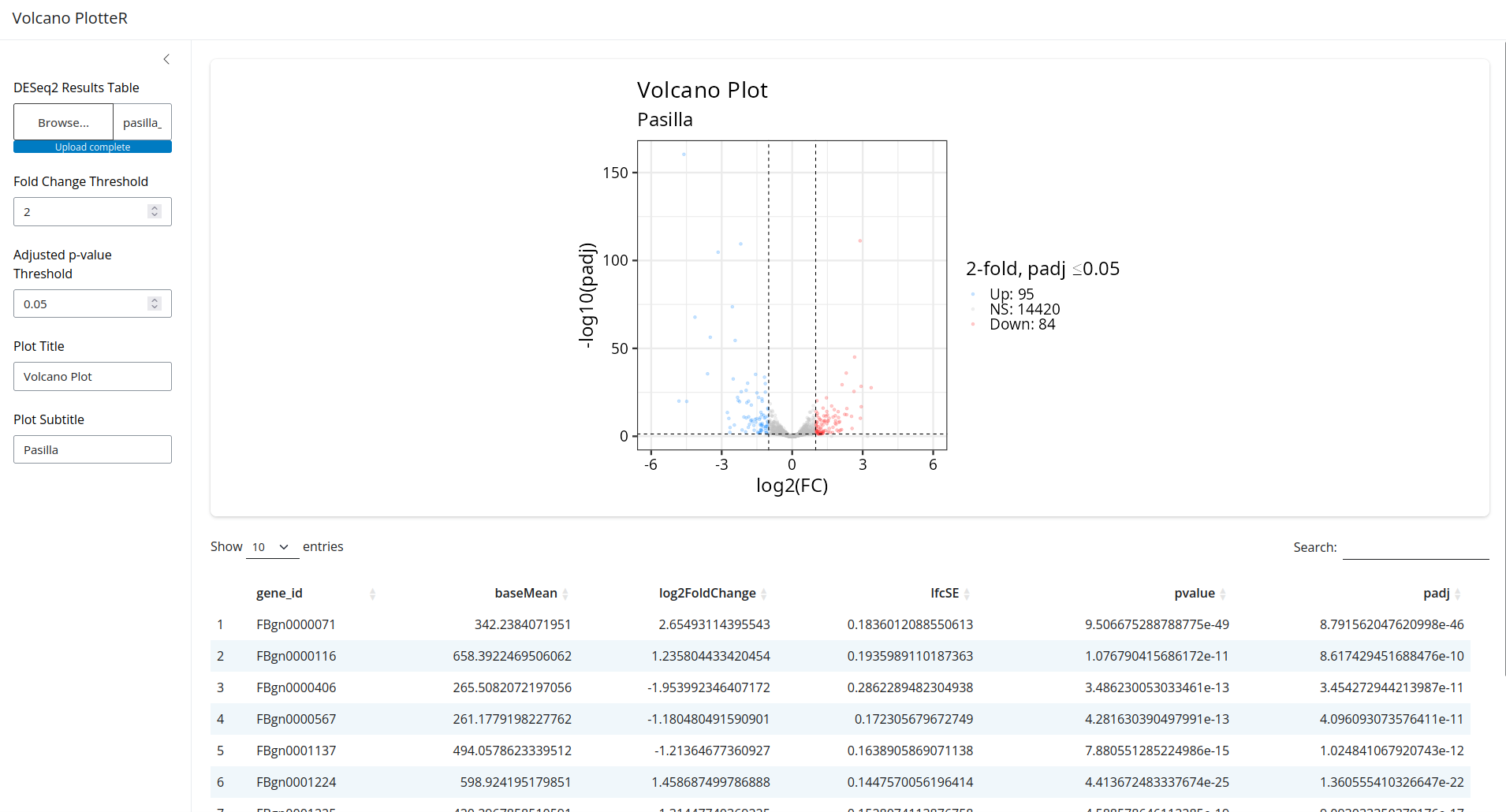
If you navigate to the IP address and port in your favorite browser you should
see the fruits of your labors. After clicking the browse button you can load
the pasilla_results.csv you created earlier:
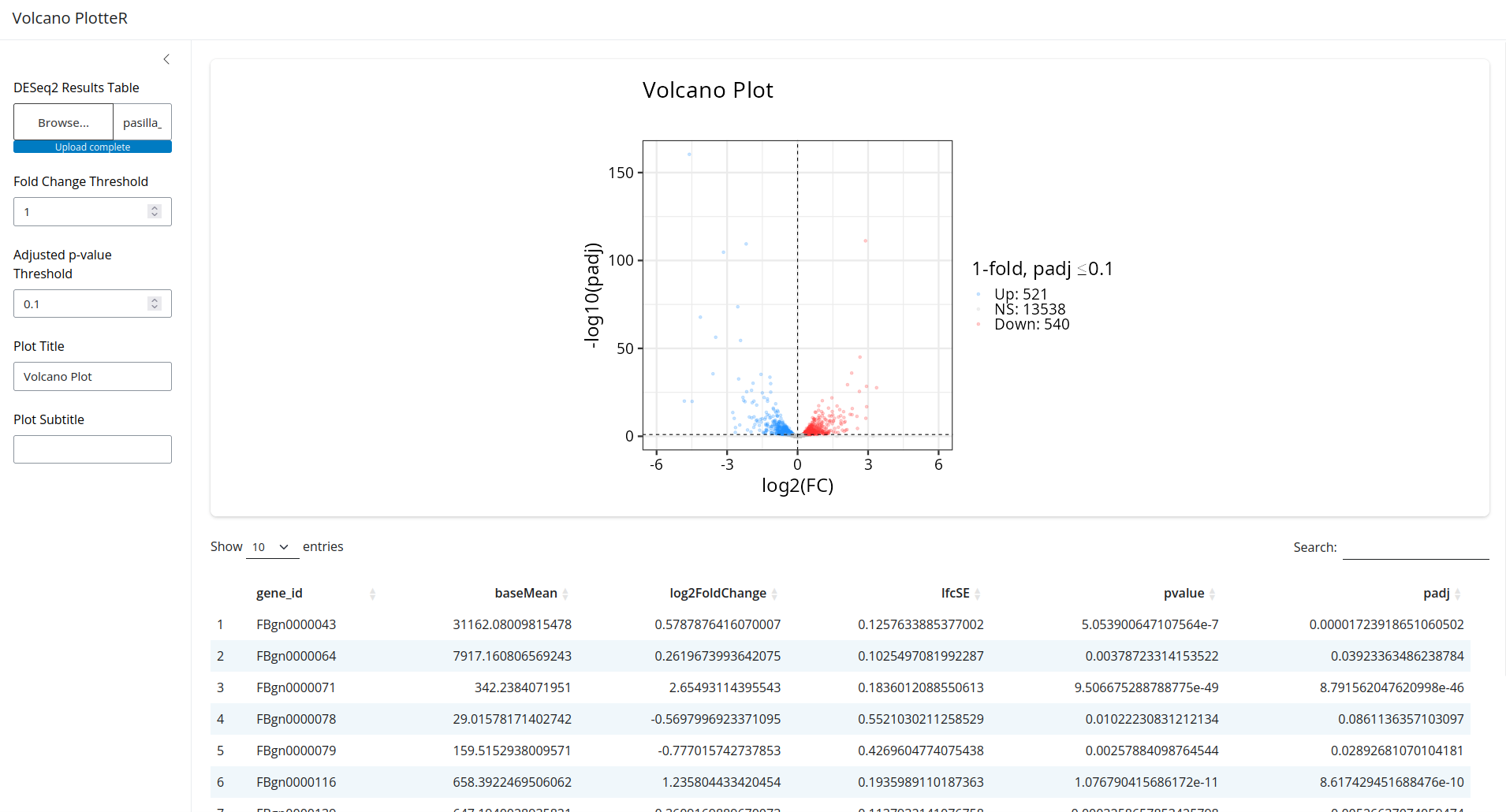
That looks great! Now try changing the controls on the left. You'll see that the plot and table react in real time!
Explanation
If you ignore the volcano plot code, which is mostly the same (with some changes and simplifications) as my explanation in a previous post you're left with only ~50 lines of code. That's really not much to get an interactive web app.
The main logic of the app is broken up into two parts, the ui (defined by
layouts and content) and the server() function. The inputs and outputs in the
server function map to the names of the inputs and outputs from the ui. You can
have different types of outputs (plots, tables, etc.) in sections of the UI. In
this simple example we use the use library(DT) and the DTOutput() function
as a way to display dataframes that uses the javascript DataTables library as a
backend. Likewise our volcano plot code uses ggplot2 and the plotOutput()
function displays it. At the end of the code, we run shinyApp() with our ui
and server to make it all happen.
There are a few other things of note going on here. We've wrapped filtering of
our results table and plotting in reactive(). This does exactly what you
think, it makes the plot and data table react to changes in the input data. So
when you change the data that was loaded in, or any of the controls that map to
filtering criteria, etc. the elements are regenerated. The req() function in
there identifies that the input dataset is the element to which the output
reacts. Hopefully that makes sense. For a simple example, I think that
explanation suffices.
All of these packages and functions have great documentation that goes far beyond what I've written here, so I recommend reading it. You can add a lot more functionality without too much trouble, this is just a simple example.
What Can You DO With This?
Imagine you're in a meeting and you're having that back and forth with the wet lab scientists I talked about earlier. Now, you can pull out your shiny app and use that as a tool to filter data, generate visualizations, and save the output on the fly. Even better, if you get really ambitious you can containerize it, serve it on your LAN, and let anyone use it!
I suspect the bench scientists will be happy because they can filter, visualize, and do whatever else you've built for them. You'll be happy because your meetings can be more productive and your colleagues can generate more insights on their own and bring those to you for in-depth analysis.
The more I think about what the optimal split of duties for a genomics project should be, the more I think we should be developing simple tools like this. Small interactive apps like this allow bioinformatics staff to focus on solving hard problems, making sure data is processed consistently, figuring out how to apply novel methods to lage datasets, etc. The other stakeholders who help to generate the data can be empowered to explore that data without the burden of knowing how to process it from raw files, but still get to have an active role in generating insights.
Shiny and similar frameworks have relatively easy syntax to learn when getting started if you're already familiar with R or python. While there are certainly commercial products that have functionality far surpassing these small apps, if you're looking for a simple tool to help bridge the gap between wet and dry lab scientists this may fit the bill at $0, aside from your labor :).
Reference
Huber W, Reyes A (2024). pasilla: Data package with per-exon and per-gene read counts of RNA-seq samples of Pasilla knock-down by Brooks et al., Genome Research 2011.. R package version 1.32.0.