Making Better Metaplots With ggplot, Part 1
Posted on Thu 27 June 2019 in how-to
Commonly, in bioinformatics we're in the business of determining whether something, be it gene expression, or DNA methylation, or splicing, etc. is different between multiple conditions. Typically this would be done by comparing those data and using some kind of statistical test. However, with the continued advances in sequencing technologies generating greater read depth, and these technologies becoming more available to researchers we can also look at genome-scale data in other ways. Testing purely on count or score data does not inform one of the positional information associated with that data.
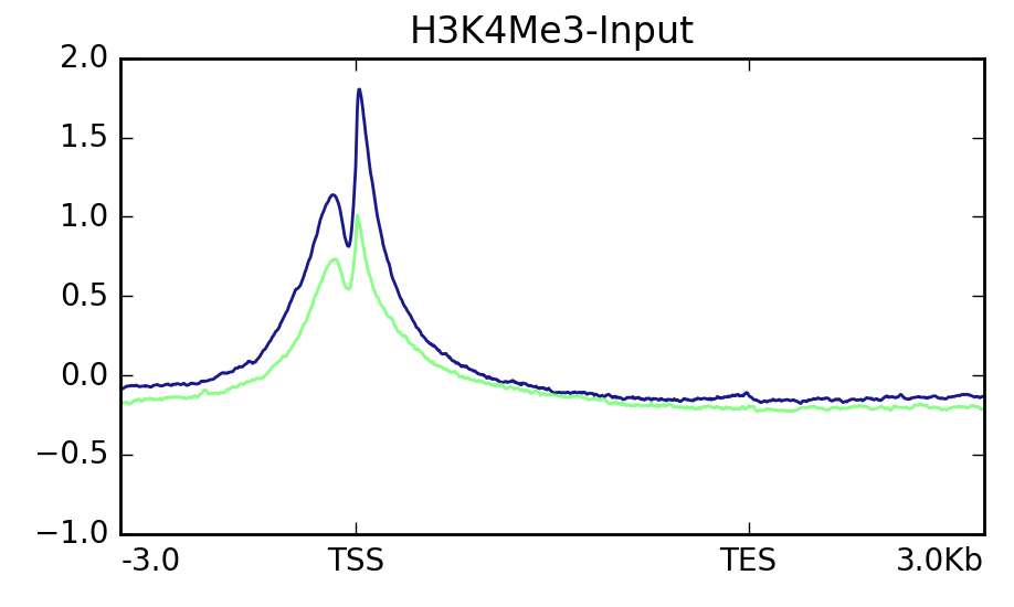
To look at the positional context associated with genomics data we have several options. One common way is a visualization that's often referred to as a "metaplot" or "metagene plot." These plots are similar to the TSS or "peak" plots commonly used to visualize chip-seq or similar data. In a metaplot the entire length of a feature is scaled such that each feature now is composed of the same number of "bins" of data. This allows one to visualize the data associated with these features across their entire length. There are existing software packages that can make these plots without too much trouble such as Deeptools or the Genomation R library. In particular, I find Deeptools to be a great software package, and it makes some wonderful visualizations that would be a pain to make yourself. Genomation requires one to be very familiar with R since it isn't a standalone program. Deeptools is easier to use but its metaplots leave something to be desired:
I like the control I have over all plot elements and the professional look that ggplot affords. I use it for most of my data visualization needs. So, I figured, why not make something prettier with it?
1. Install Required Packages
This guide will use Deeptools, a Python package with a ton of functionality that you can play around with later, and ggplot2 from the tidyverse. The tidyverse is a collection of R libraries designed by Hadley Wickham that make data science a snap. You can install them as follows in a terminal:
pip install --user deeptools
Launch the R interpreter by typing R and then:
install.packages('tidyverse')
I recommend installing them into a user-specific library by either the --user
flag for pip or setting up a .Renviron file with a path to a local library. You
can learn how to do that in my
previous post.
You're also going to need samtools. Feel free to
use the package manager of your choice if conda is more your jam.
2. Generate the Data Table With Deeptools
Now that you've got the software installed you'll need to generate per-position "score" information. If this is expression data or similar you can use Deeptools again. But you should be able to use other inputs to the later steps as well. If using expression data you can use your bam file you can use Deeptools' bamCoverage tool. First, you need to index the alignment .bam file:
samtools index ${input_bam} ${input_bam%.bam}
${} is the syntax for using a previously declared variable in BASH and I'll use
that kind of representation throughout for places where values should be
specified.
Now that you have that out of the way. Your first step is to generate a coverage file in bigWig format. This is a binary format but contains similar data to a bedGraph. You can use the bamCoverage tool:
bamCoverage \
    -p ${threads_to_use} \
    --binSize 1 \
    --normalizeUsing ${RPKM|CPM|BPM|RPGC} \
    --outFileFormat bigwig \
    --bam ${input_bam} \
    --outFileName ${input_bam%.bam}.bigWig
A --binsize of 1 will just generate per-base converage. This may be slow, and
you could increase the value if you wish. There are also other ways of generating
coverage/depth such as mosdepth (a great
tool by Brent Pedersen). This comes with Deeptools though, and is easy to get
running. The --normalizeUsing option will let you normalize the coverage by
several methods, which is particularly useful for plotting multiple experiments
together at the end.
Next, you'll need to generate a score matrix. In other words, a matrix of coverages or other values of interest. This step can be done on any score data in a bedGraph/bigWig file, even if you did not generate it with Deeptools. So, if you're using data from a tool other than bamCoverage this is your starting point.
computeMatrix scale-regions \
    -p 10 \
    --startLabel start \
    --endLabel end \
    --upstream ${base_pairs} \
    --downstream ${base_pairs} \
    --regionBodyLength ${scale_length} \
    --regionsFileName ${regions_bed} \
    --scoreFileName ${input1_bigWig} ${input2_bigWig} \
    --outFileName ${output_matrix.gz}
The --startLabel and --endLabel values can be changed as desired, but don't
forget them! The --upstream and --downstream values can be as desired. The
--regionBodyLength is the value to which all features will be scaled. I suggest
using either the mean or median length of the features of interest. The regions
will be input as a .bed file, and the bigWig files that were generated in the
previous step will be used where indicated. Multiple files can be input,
space separated. You can specify that the matrix be gzipped by simply adding .gz
to the name of your output file. Now, the final step is to generate the plot and
also output the raw data:
plotProfile \
    --startLabel start \
    --endLabel end \
    --averageType ${mean|median} \
    --matrixFile ${input_matrix.gz} \
    --outFileName ${metaplot.svg} \
    --outFileNameData ${metaplot.tab}
This will generate a plot, but also output the table of per-bin values that were plotted. I made this with it:
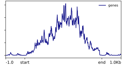
I could play with Deeptools further, but the options for changing its aesthetics are more limited than I'd like. In particular, smoothing the lines requires smoothing the underlying data in the scoreMatrix step. Which I am not a huge fan of. Now, let's load that table into R and make something prettier in Part 2.